tennisboxd - the all in one app for fans
tennisboxd is Letterboxd for tennis: fans log, rate and review pro matches, follow other fans and play tennis games. As the app moved to native iOS, I redesigned its navigation, the way you log a match, and its visual system.


01 · Overview
A loved app with a lot hiding in it
tennisboxd lets fans rate matches out of five stars, write reviews, engage with the tennis community, and play daily games in the Fan Zone. It runs on iOS, Android and on web.
My heuristic review started with one note: “Love how many features there are, but some might feel a bit hidden.” The goal was to make those features easy to find without taking any away, while Thales rebuilt the iOS app in native Swift.
users
ratings
matches rated
Source: tennisboxd.com/about
“I see this going SO far!!”
5★ App Store review, Aug 2026, before the redesign. Fans already valued the content; the job was to make it easier to find.
02 · Pain points
Three problems in the old app
Every feature was there. Fans just had a hard time getting around, finding things and reading the screen.
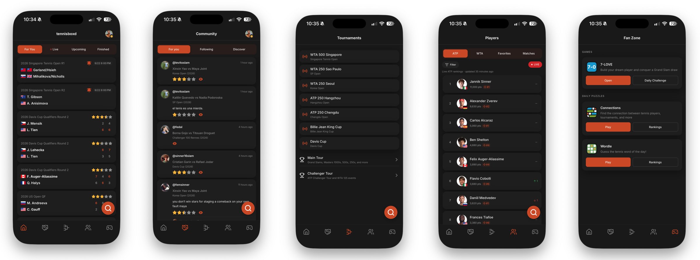

Confusing navigation and unclear icons
Profile and notifications were tucked in a side nav, and testers misread the tab icons: the people icon looked like friends, not players, and the handshake left them unsure.
Features that were hard to find
Logging a match lived behind an unlabeled floating star, search was a floating button that covered content, and stats were split between Dashboard and Profile.
Small text and confusing scores
Text was small throughout, and match cards were hard to read: labels flipped between tournament and venue, finished matches had no date, and community stars sat right next to the score.
03 · Navigation
Redesigning the main navigation
Adding Profile without space for a sixth tab meant I had to combine two. I decided to combine Matches and Tournaments to live together on Home, which moved to the middle of the tab bar.
Before
Profile lived in the side nav
After
+ search, notifications and menu in a header pill on every tab; the app opens to Home

Icons that mean what people guessed
The people icon now opens Community, which is what testers expected. A list icon is Rankings, a trophy is Home, the controller is Fan Zone.
One header for search, alerts and menu
Universal search replaces the floating button. Notifications get their own bell instead of sitting low in the side nav.
A drawer for settings only
A flat list with single-color icons. No dropdowns, and Settings and Preferences are no longer separate.
“Dashboard” becomes “My stats”
It moved onto Profile, ending the duplicate stats and the “Home” vs “Dashboard” confusion.
04 · Logging a match
Making it more intuitive to log a match
Rating a match is the core of tennisboxd, yet the only way to do so was clicking an unlabeled floating star. The match page was updated to make the score clearer and a "Log Match" button was added.
Before

The big stars in the middle of the old match page showed the community rating, not yours. The only way to rate the match yourself was the unlabeled floating star in the corner.
After
Typing sped up 3×
Every match page has a labeled “Your log” section with one full-width Log Match button. Once you save, your own stars show there, separate from the community’s.
05 · Screen by screen
Clearer, calmer, easier to scan

Home: matches
- One long list of boxed cards became sections: Live now, Just finished, Trending.
- Live now scrolls sideways with game points.
- Winner in bold with a check mark, loser dimmed.
- “Just finished” answers testers’ “when did this end?”

Community
- Boxed posts became an open list with dividers.
- The match name leads each post; stars, tournament and date share one line.
- A “Liked by” row, and a header that collapses on scroll.

Players → Rankings
- Two tabs (ATP / WTA) instead of four; Favorites moved to the menu.
- Plain text like “9,450 pts · Career High #1” replaces the small diamond badge.
- Live vs. official toggle, bigger photos with flag badges.

Fan Zone
- Games got tennis names: tennisboxdle and tennisboxd connections.
- One main button per card, with a quieter second one.
- Context lines like today’s 7-LOVE mode and streaks, so it no longer feels empty.
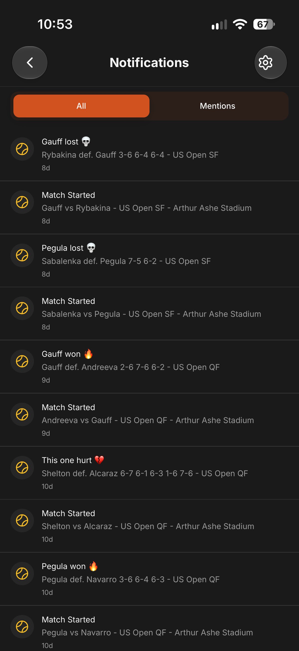

Notifications
- Reached from the bell in the header, on every tab.
- Two orange pills became five type tabs: All, Matches, Followers, Games, Mentions.
- Unread rows in bold with a blue dot, plus mark all as read.
- “8d” became “2 days ago.”
Profile
- Now a main tab.
- Name above the @handle, as testers asked.
- My stats (formerly Dashboard) sits next to your lists.
- New logs appear at the top of Activity.
06 · Introducing the update
Showing returning fans where everything went
Almost every tab, menu item and entry point moved. Returning users see a five-slide “what’s new” tour on first launch, each slide highlighting the one thing that moved.

Welcome to the new tennisboxd

One search for everything

Matches and tournaments on Home

Your dashboard is now My stats

Settings in the menu
07 · Results
Launched on iOS in November 2026
After launch I ran design QA on the live build: a shorter opening animation, “Singles / Doubles” instead of “Men / Women,” search that understands “alcaraz vs sinner,” and spacing fixes on Rankings filters.
What’s next
Still on my list
Google Analytics will show how the redesign performs in real use: whether more fans find their profile, log matches and use search. I’m also planning more usability testing with fans to check that the navigation and logging changes solved the problems from the first round.