NOW (News in Our World) is a platform that brings together social impact and social media, built for young activists to learn about and share causes and issues happening in our world. This team project is part of the RISE Internship Program.
Timeline: July 2020 - September 2020
Role: UX/UI Designer & Researcher (1 of 2 designers on the team)
Responsibilities: User Research, Wireframing, Prototyping, Visual Design, Usability Testing
Our team includes Designers, Product Managers, Engineering Managers, and Developers. We created a working MVP in 9 weeks while working across 5 different time zones. Every week, we had full-team meetings to update each other on our progress, and we also met with engineering managers & product managers in separate meetings throughout the week to sync-up and discuss feature planning and developers’ constraints.
Research 🔎
Quantitative:
We surveyed 139 students & young professionals between the ages of 14-26.
89.7% of those we surveyed use social media to learn and post about current events and issues.
61% of those we surveyed think it’s important to take the extra step to validate the information and mutual aid resources they find on their social media feeds.
Target audience: Gen Z
Qualitative:
I interviewed students from various universities and young working professionals about their experiences with learning about current events online.
Many people worried about toxicity & performative activism on social media platforms, especially Instagram.
There was a general consensus that people were worried about the credibility of the sources they read.
Interviewees mentioned that social media has given them the opportunity to absorb lots of bite-size information, which can be biased and contain buzz-words designed to garner emotion rather than educate.
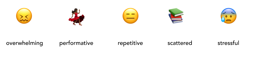
We asked our target audience about their feelings towards social media platforms and they told us what words immediately came to mind when describing their feeds:
Problem: Users want to stay educated about current events, but they are flooded with lots of repetitive information on social media platforms that isn’t always credible. They have trouble figuring out how to make an impact while maintaining a sense of social connectedness that doesn’t seem artificial or performative.
Today’s popular social media platforms were not designed to properly educate the public about current events, and they can be hotspots for toxicity and misinformation. Our team created NOW for a new generation of passionate individuals who want to stay informed about the world around them and create lasting change in their communities.
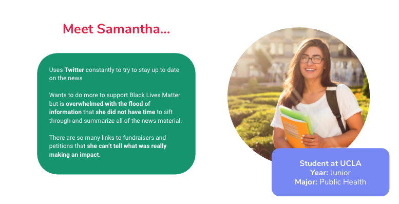
Our proto-persona, Samantha. We used this persona to guide our designs and help us understand our users’ needs, experiences, behaviors and goals.
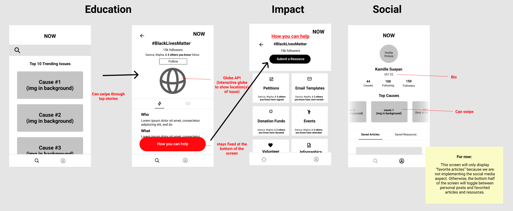
NOW has 3 focuses…
These are core elements of the app that are based on our need-finding interviews.
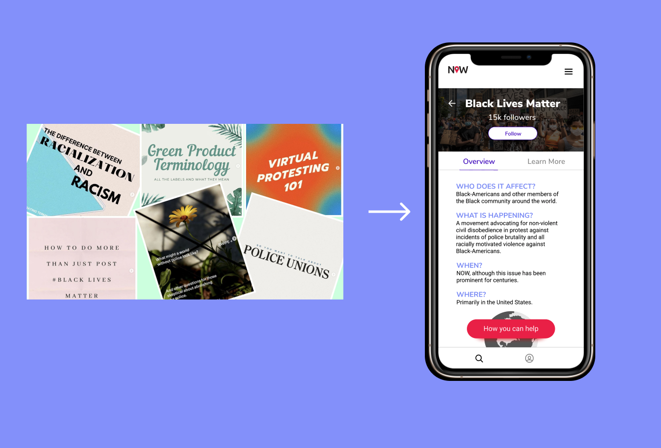
Education 📝
The platform provides users with both a quick read and access to news articles related to the issue or current event.
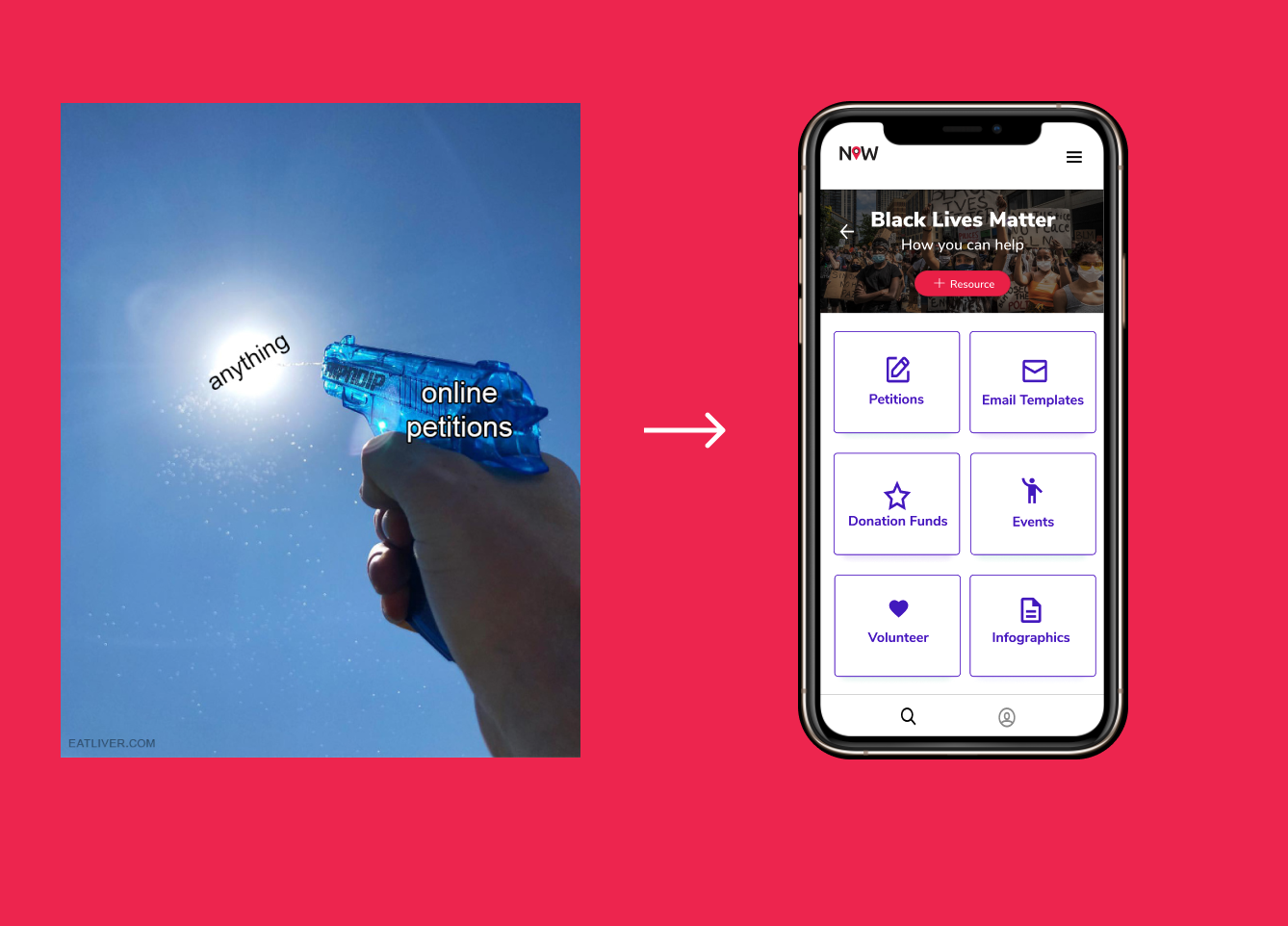
Impact 🤝
Gives users access to resources such as petitions and fundraisers from credible organizations.
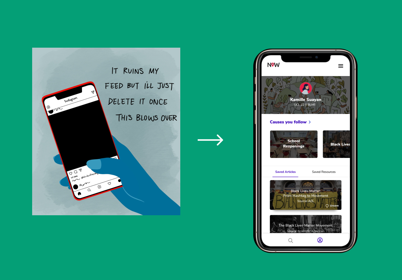
Social Connectedness 👩🏽🤝👨🏻
Impact resources are community sourced and vetted. All users have a user profile to save articles and resources and to display causes they follow.
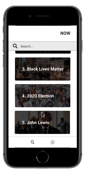
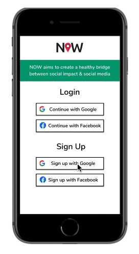
Initial Wireframes
We mocked up our first wireframes with our 3 focuses in mind.
Prototype v.1
We added content to the wireframes and conducted our first round of user testing on the education and impact aspects of the platform.
We tested this first version on 10 people, who were all high school or college students. We asked our users to complete specific goals, such as learning about the Black Lives Matter movement, viewing the petitions page, and contributing a resource themselves. Then, we asked follow-up questions to get information about their experiences navigating through the app.
Our most positive feedback was for the “How you can help” page. Everyone liked that resources were consolidated into one accessible page.
There was a little confusion about how users could “learn more” about an issue. We realized our “link” & “lightning bolt” icons weren’t strong enough signifiers.
Our users thought the red “how you can help” button was eye-catching without being overwhelming.
There were some concerns about the credibility of the sources and articles on our app - “Who is vetting these resources?” “Can anyone add a resource?”
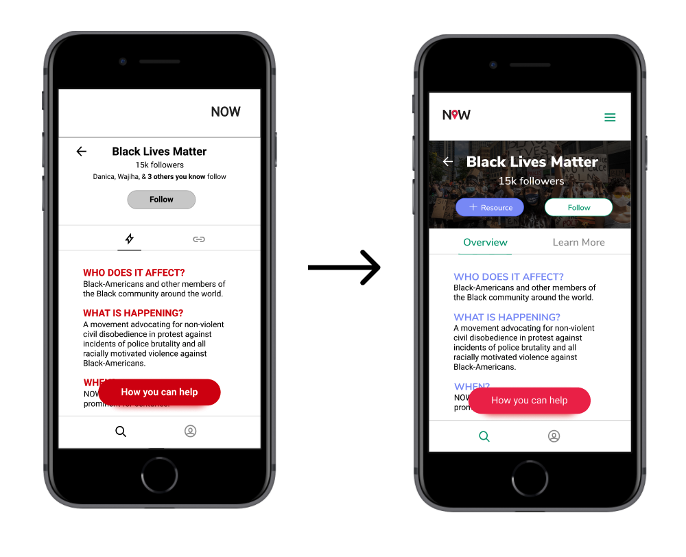
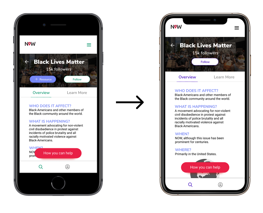
⚡️ Design Decision
During testing, users had a hard time figuring out what the lightning bolt and link symbols meant, so we changed the headers to Overview and Learn More for clarity.
Prototype v.2
Using feedback from our first round of user testing, we changed some verbiage and enhanced our visuals. We also included the social aspect of the platform in the second round of testing with this prototype.
Our second round of testing was conducted with 8 new participants, all college students. This time, we asked them to perform the same tasks from the first round of testing, and also asked them to see their “top causes” and “saved resources” on the user profile. We also asked them questions about the aesthetics of the app as we tried to narrow down a color scheme.
This time around, none of the users had trouble learning more about the BLM movement because of the clearly-worded headers.
Questions were asked about where the information about BLM was gathered from. They suggested citations, which we added in the next iteration.
Users wondered whether they would actually connect their social media accounts to this app, and suggested that adding a guest login option would draw in more users.
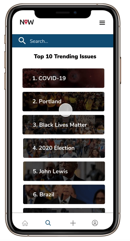
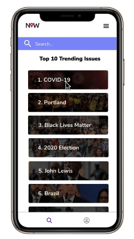
Most of the Top 10 Trending Issues seemed too “US-centric” according to user.
⚡️ Design Decision
We removed the + Resource button from the education page because users thought that they could add resources to this page themselves. They can only add resources to the impact page so we decided to only keep the + Resource button there to avoid confusion. We also decided to stick to one color instead of two for cohesiveness and readability.
Prototype v.3
We finalized our branding guide, using feedback from round three of user testing to guide us in deciding fonts, colors, and our logo.
We interviewed 10 new participants during our third round of testing. By this time, we felt confident about the app’s layout and ease of navigation. During this round, we wanted to make sure our app was as accessible as possible, so we tested the app on someone who was color-blind and someone with visual-impairments.
The majority of users mentioned that they wanted a dark mode, because all their current apps are set to dark mode when possible.
We received a few more comments about our “Reddit-style” of resource sourcing, where large organizations might overshadow small fundraisers simply because of their ability to receive more upvotes.
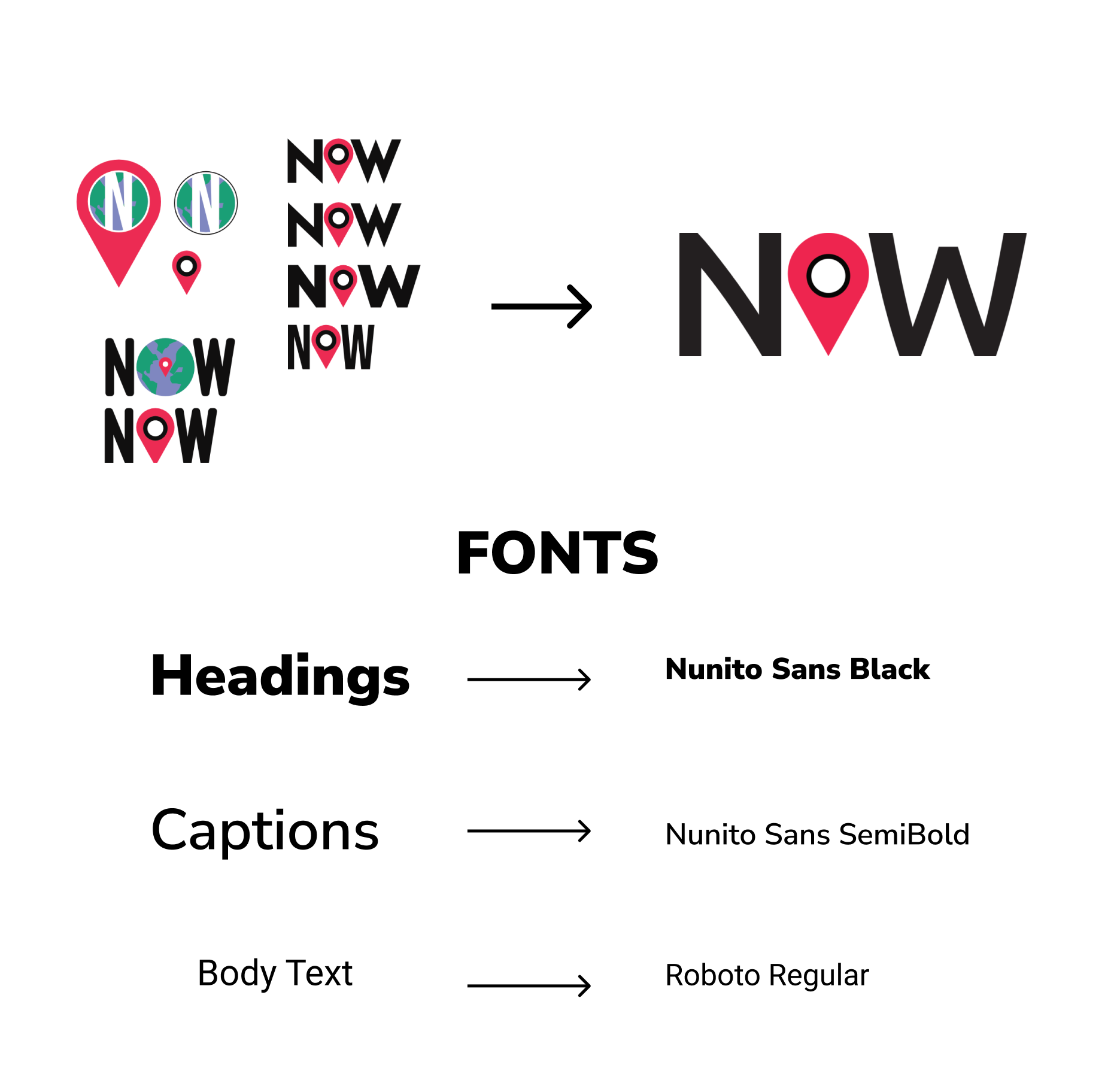
Style Guide
Our logo is composed of a location marker which reflects how our app talks about issues all around the world. The font, Ubuntu, is a traditional sans-serif typeface with rounded edges for a slightly playful look, which appeals to Gen Z.
Why our solution works 💡
We have reframed the pain points that potential users explained to us in our research and turned them into opportunities for our solution.
Pain Point: Learning about current events through social media is overwhelming.
Solution: Our clean UI & intuitive UX along with quick 2 minute overviews of issues allows users to absorb information easily and efficiently.
Pain Point: User wants to make an impact but doesn’t know where to start or how to help.
Solution: Dedicated impact page
Pain Point: Social media can be a gateway for performative activism.
Solution: No quantitative metrics (numbers of likes, followers) on user profiles.
Working Prototype on Figma
On the upper right hand corner, press options -> fit. Then, feel free to click around the app to explore our features or use the arrow keys on your laptop to look at each screen.
Reflections 💭
Collaborating with a cross-functional team of talented designers, developers, engineering managers, and product managers was a very rewarding experience! We enjoyed working with each other so much that we are continuing this project past the internship’s official end date. Here are some lessons I learned so far:
Feasibility > Fun Features
It is imperative that the designer is constantly communicating with the engineering manager to make sure that what they are creating is doable on the developers’ end. My co-designer and I wanted to implement a dark mode and a spinning globe on our education page, but these features weren’t feasible given our time constraints.
Go into interviews & usability tests with no expectations
I learned a lot about the importance of listening (sometimes even staying silent on purpose so my users would talk more) during the testing process. Sometimes, users would start talking about something completely different than I expected, but it actually led to interesting insights about our app. It’s also important to never ask leading questions and let interviewees control the conversation. They might provide insights and suggestions that you never would have thought of!
Always focus on the main problem at hand
During the entire development process, we always focused on the 3 main parts of our app: education, impact, and social connectedness. Every feature that we designed was based on creating a solution for the problem we found during the research process; nothing was created arbitrarily or just for fun. By following this philosophy, we were able to provide solutions for our pain points efficiently under a tight schedule.