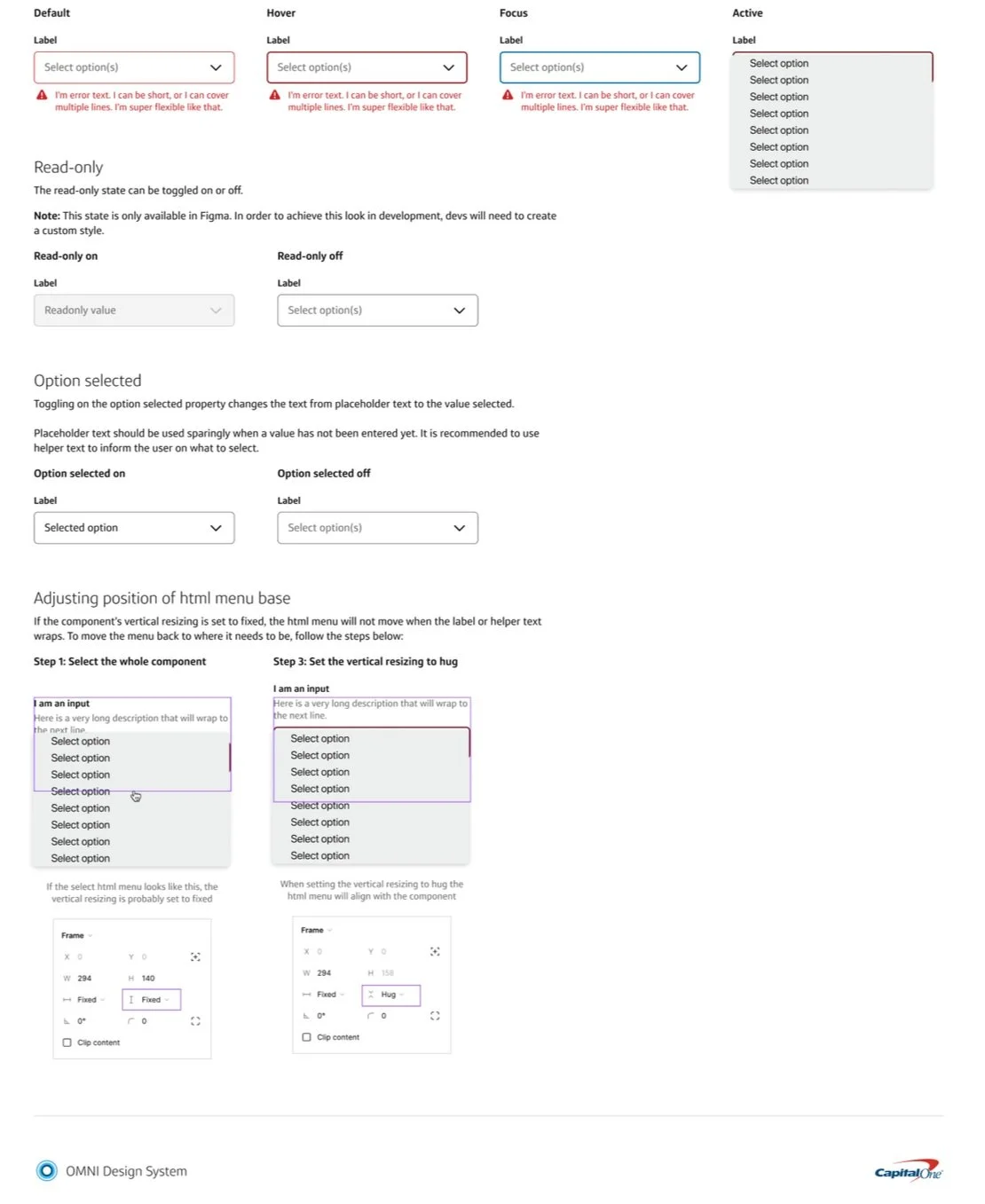
Designing + documenting components and patterns for an enterprise design system
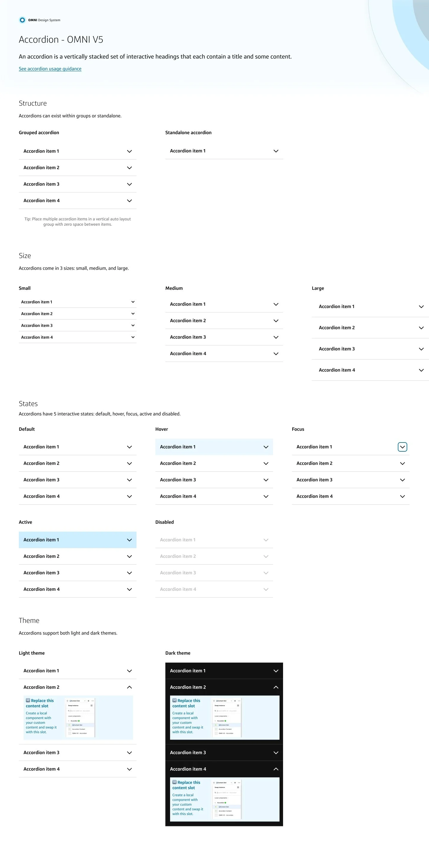
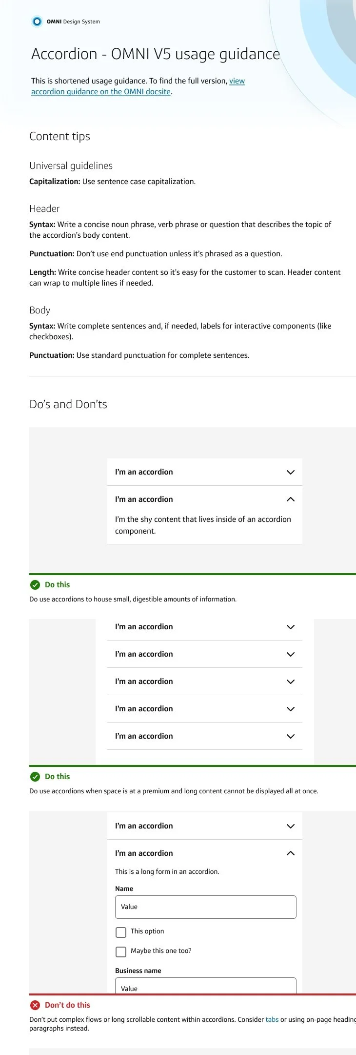
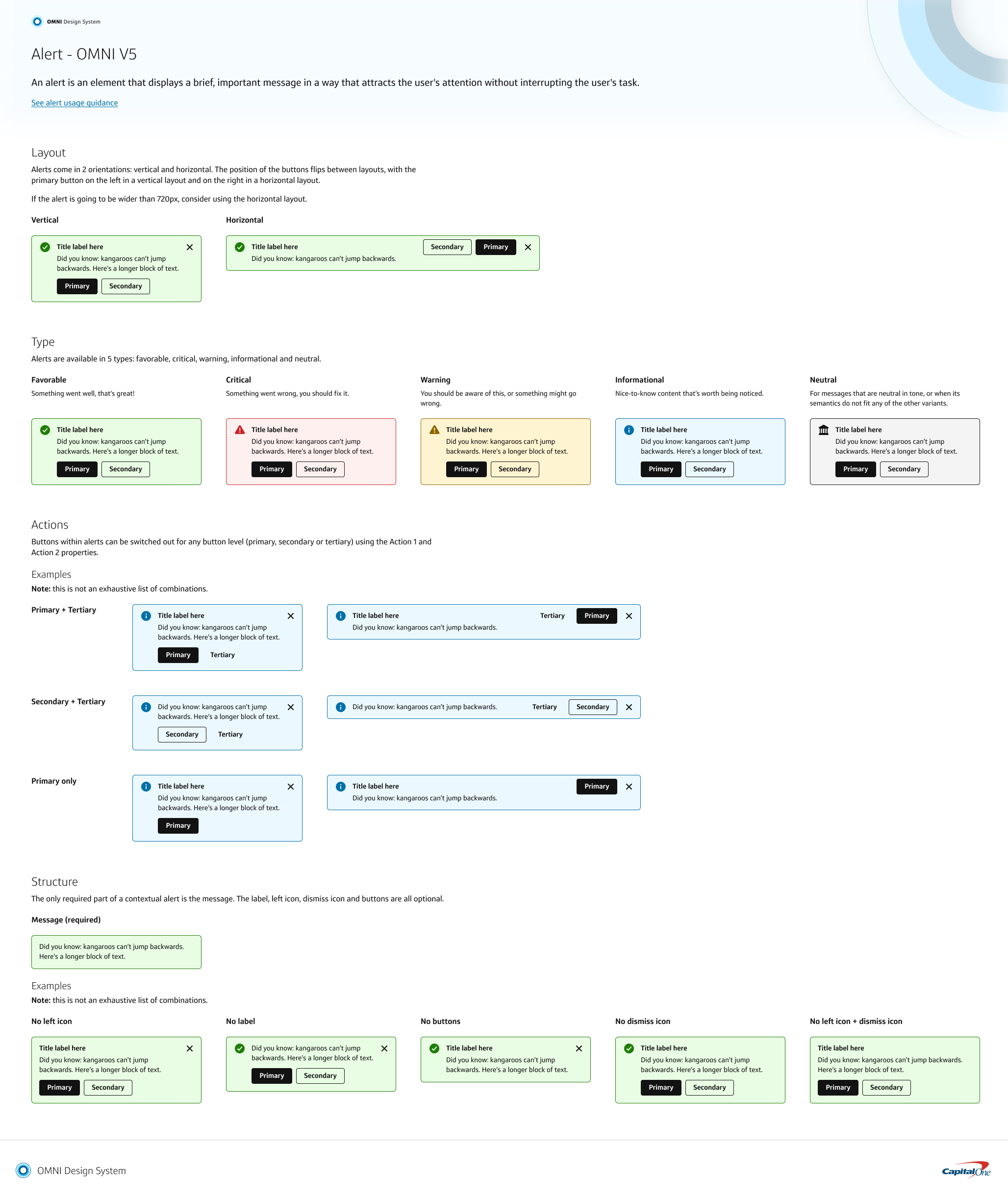
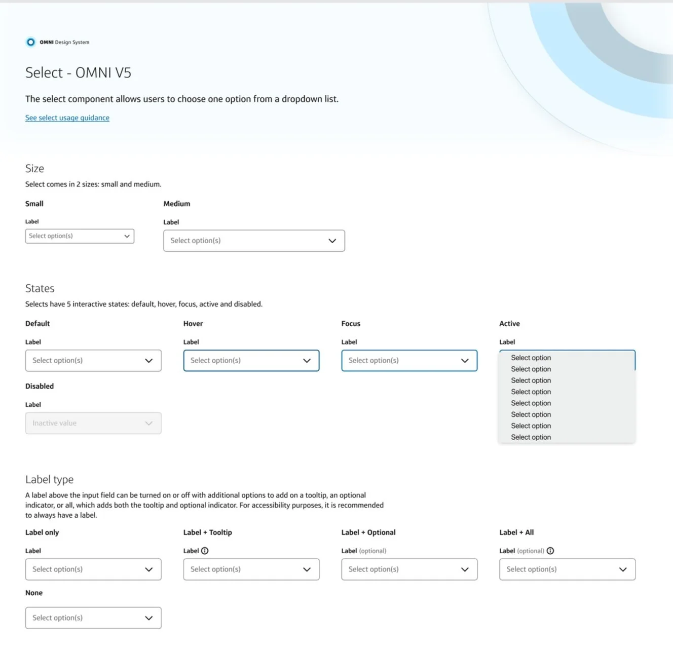
When I joined Capital One’s Design Development Program and was placed on a design system team for my first rotation, I felt intimidated. As someone with intermediate Figma skills and low confidence in my visual design abilities at the time, designing the essential building blocks for other products and other designers at my company seemed daunting. At the end of my first year on this team, I designed, built, and shipped ten components & their documentation for the enterprise. I also revamped the Foundations Library with a focus on improving accessibility and design tokens.
Timeline: August 2021 - August 2022
Role: Systems Designer (1 of 3)
Responsibilities: Designing & building component & pattern libraries, as well as writing documentation for the components.
Our business benefits when internal users have powerful and easy to use software, tools, and systems to help them do their jobs.
Foundations
Colors
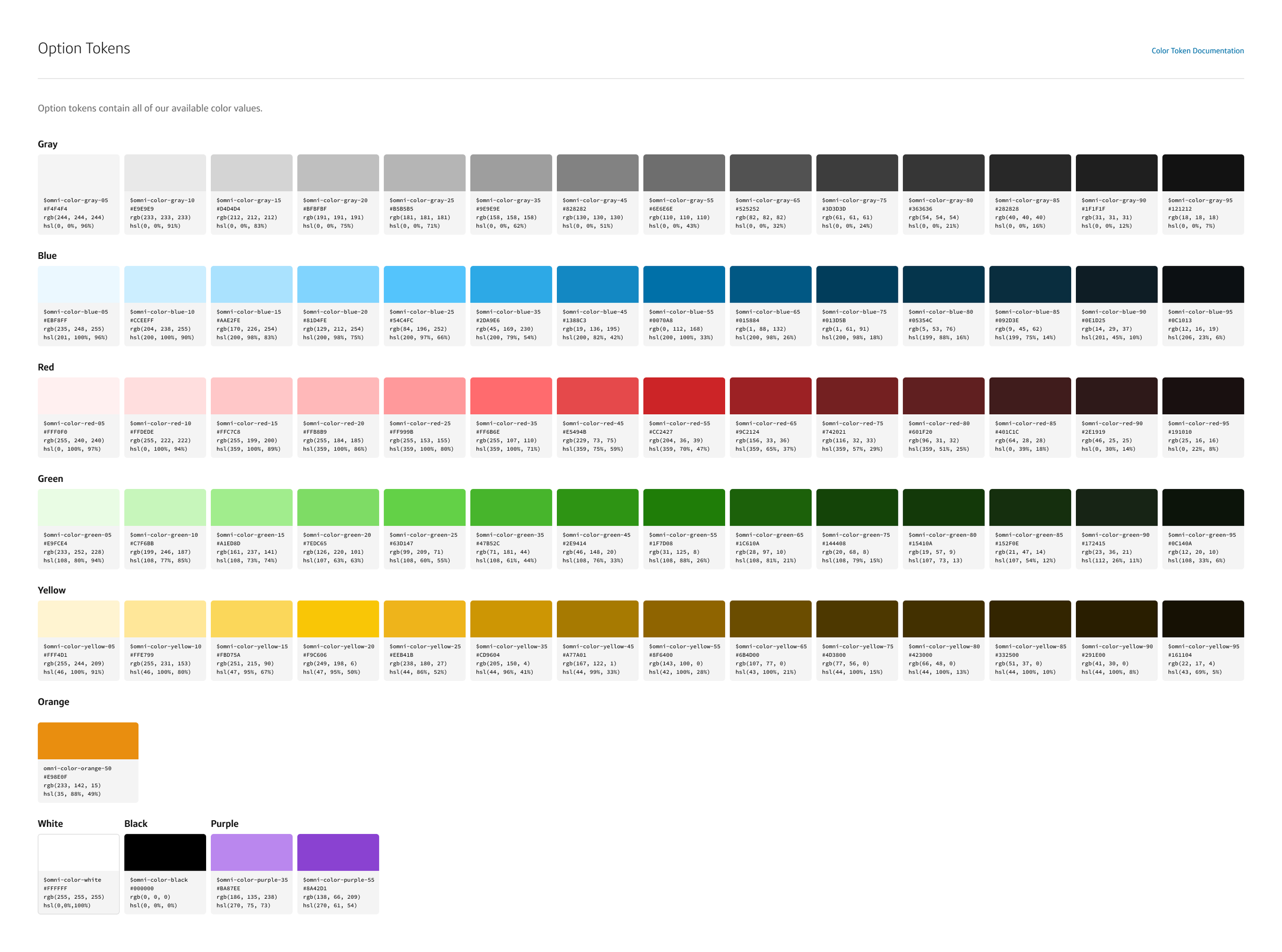
We follow Capital One’s enterprise brand colors in our design system. One of my responsibilities was to ensure all of our digital color combinations adhered to WCAG 2.2 Level AA contrast ratio standards.
Tokens
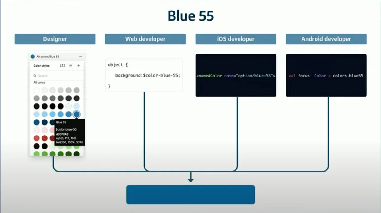
We use tokens to define a set of options for visual design attributes such as color, font-size, and spacing. OMNI uses the design tokens as a source of truth for the names and values in the systems. Code generation is used to output the tokens into various formats for use in the target platforms and frameworks.
Typography
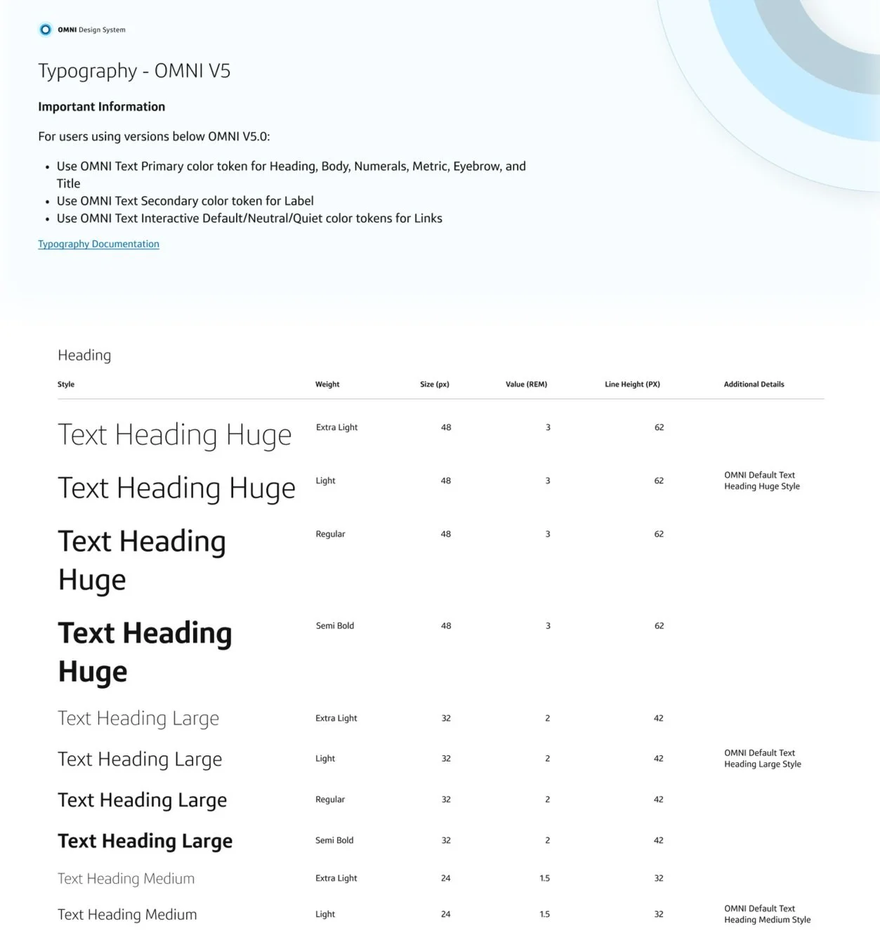
We offer many options of weights, font sizes, and styles for our Optimist typeface. Our typography styles are also linked to design tokens for developer use.
Patterns & usage guidance
I built components using slots so designers could easily input their own content while still maintaining the correct properties of the design system. For example, in this side drawer below, the user has a component that they’ve already created with e-signing instructions and they drop it into the slot in the side drawer component. Their content automatically adjusts and fits in the drawer perfectly.